字段
关于
AutoForm的所有字段组件均是以auto-field-开头的WebComponent,用于渲染表单字段。
字段组件的DOM结构如下:
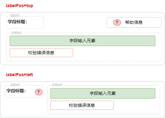
字段的DOM结构由以下几部份组成:
| 名称 | 描述 |
|---|---|
| 字段标题 | 支持显示在左侧或顶部 |
| 字段输入元素 | 支持各种输入字段元素 |
| 帮助信息 | 额外的帮助信息 |
| 错误信息 | 当校验出错时显示信息 |
指南
声明字段
在AutoStore状态使用configurable方法声明字段,
ts
const store = new AutoStore({
    user: {
        username: configurable('NAME', {
            label: '用户名',
            widget: 'input'
        })
    },
});使用configurable声明状态中的某个状态值可配置时,可通过widget参数指定要渲染的字段组件类型。
支持的字段组件:
captcha,checkbox-group,checkbox,color-picker,combine,custom,date,email,input,ipaddress,list,number,parts,password,phone,qrcode,radio-button,radio,range,rating,search,select,switch,textarea,time,tree-dropdown,tree-select,upload,url,verifycode
字段帮助
字段可以通过help参数指定额外的帮助信息。
ts
const store = new AutoStore({
    user: {
        username: configurable('NAME', {
            label: '用户名',
            help: '请输入用户名'
        }),
        password:configurable('', {
            label: '密码',
            widget: 'password',
            // 启用超链接
            help: '密码至少6位(https://zhangfisher.github.io/voerka-i18n/)'
        })
    },
});帮助信息可以在未尾(<url>)启用超链接
loading
通用字段属性
使用configurable函数声明一个状态的值可配置,即字段,可以传入多个字段属性。
ts
const store = new AutoStore({
    user: {
        username: configurable('<默认值>', {
            // ... 字段参数或属性
        }
    })
字段支持以下通用属性:
ts
export type SchemaWidgetShareOptions<Value, State> = {
    name?: string;
    required?: boolean;
    visible?: boolean;
    enable?: boolean;
    description?: string;
    size?: string | number;
    icon?: string;
    // 用于验证
    invalidTips?: string | ((e: Error, path: string, newValue: Value, oldValue: Value) => string);
    onValidate?: (newValue: Value, oldValue: Value, path: string) => boolean;
    onFail?: 'pass' | 'throw' | 'ignore' | 'throw-pass';
    // 提供一些元数据
    label?: string;
    labelPos?: string;
    // 帮助信息可以增加一个链接,如"至少需要增加(http://www.baidu.com)"
    help?: string;
    placeholder?: string;
    group?: string;
    advanced?: boolean;
    order?: number;
    width?: number | string;
    height?: number | string;
    divider?: boolean; // 是否在前面显示一条分割线
    viewAlign?: 'left' | 'center' | 'right'; // viewonly模式下显示方式
    tips?: string;
    select?: (SchemaWidgetSelectItem<Value> | string | number)[];
    // 转换数据
    toView?: (value: any) => any;
    toState?: (value: any) => any;
    toInput?: (value: any) => any;
    toRender?: (value: any) => any;
    actions?: SchemaWidgetAction<State>[];
    // 用于扩展widget样式,如{"<选择器>":"样式"}
    styles?: SchemaWidgetStyles;
    // 用于扩展widget类,如{"<选择器>":"类名"}
    classs?: SchemaWidgetClasss;
};
字段宽度/高度
可以通过width和height参数指定字段宽度和高度。
loading
提示
当在一行中显示多个字段时,需要指定height参数以确保字段高度一致。
自定义浏览视图
toView方法用于自定义浏览视图。
ts
const store = new AutoStore({
    user: {
        age: configurable(18, {
            label: '年龄',
            toView: (value) => {
                return `<span
                style="color:red;border:1px solid red;padding:4px;">
                ${value}岁</span>`
            }
        })
    }
});
loading
必填字段
required参数用于指定字段是否必填。必填字段显示红色*号。
ts
const store = new AutoStore({
    user: {
        name: configurable('', {
            label: '姓名',
            required:true
        })
        password: configurable('', {
            label: '密码',
            required:true
        })
    }
});
loading
状态数据转换
toInput和toState方法用于状态数据和输入之间的转换。
toInput: 用于将AutoStore中的状态数据转换为输入数据用于渲染和编辑toState: 用于将输入元素的数据转换为AutoStore中的状态数据
例如: 在下例状态中,sex 字段为1或0,在输入时,需要渲染为男或女,则可以如下配置:
ts
const store = new AutoStore({
    user: {
        sex: configurable(0, {
            label: '性别',
            toInput: (value) => {
                return value === 1 ? '男' : '女'
            },
            toState: (value) => {
                return value === '男' ? 1 : 0
            }
        })
    },
});
loading
样式控制
如果对字段的样式不满意,可以通过styles和classs参数进行样式控制。
- styles
类型:type SchemaWidgetStyles = Record<string, string | Record<string, string>>
用于扩展字段DOM结构下的自定义样式,支持:
ts
styles = {
    // <选择器>: <样式>
    '.label': 'color:red;border:1px solid red',
};
// 或
styles = {
    '.label': {
        color: 'red',
        border: '1px solid red',
    },
};
提示
使用 CSS 选择器时,root特指AutoField组件的shadow节点。
- classs
用于扩展字段的样式,如{"<选择器>":"样式"}
ts
const store = new AutoStore({
    product: {
        name: configurable("voerkai18n", {
            label: '产品名称',
            styles:{
                '.label':'color:red;border:1px solid red'
            }
        }),
        homepage:configurable("https://zhangfisher.github.io/voerka-i18n/", {
            label: '官网',
            widget: 'url',
            styles:{
                'sl-input': {
                    border:'1px solid red'
                }
            }
        })
    },
});
loading
提示
- 可以通过调试控制台查看字段的
DOM结构,从而进行样式控制。 styles和classs的局限性在于无法选择控制字段组件内部的WebComponent元素,所有的样式控制都只能针对字段组件本身。
字段联动
字段联动指的是字段之间相互影响。
例如:在 IP地址配置表单中,当启用 DHCP 时,IP 地址和子网掩码字段被禁用或隐藏,当禁用 DHCP 时,IP 地址和子网掩码字段必须填写。
字段联动的核心原理是基于AutoStore,当创建AutoStore实例时会扫描收集所有被configurable修饰的状态字段,并使用AutoStore.shadow()方法创建一个Shadow AutoStore对象,用于存储所有可配置数据。
例如:
ts
const store = new AutoStore({
    user:{
        username:configurable('',{...}),
        password:configurable('',{...}),
        age:configurable(18,{...}),
        sex:configurable(1,{...}),
        vip:configurable(false,{...}),
    }
})上述代码在创建AutoStore实例时,会同时收集状态树中所有被configurable修饰的状态字段,然后在内部创建一个Shadow AutoStore,
内部伪代码如下:
ts
const shadowStore = new AutoStore({
    user_$_username:{...},
    user_$_password:{...},
    user_$_age:{...},
    user_$_sex:{...},
    user_$_vip:{...}
})
// 可以通过
store.schmeas.store===shadowStore重点:
- 所有配置字段都会被收集起来创建
AutoStore对象实例,这意味着配置参数可以是计算属性,如
ts
 configurable('192.168.1.100', {
        label: 'IP地址,
        widget: 'ipaddress',
        enable: (state)=>!state.network.dhcp
}),- 创建
Shadow AutoStore对象实例和原AutoStore存在关联关系, 当原AutoStore中的状态字段发生变化时,Shadow AutoStore中的计算属性也会重新计算,并且触发字段组件的重新渲染。
在下例中,ip字段和mask字段的显示和隐藏,gateway字段的启用和禁用,都是通过Shadow AutoStore对象实例中的计算属性来控制的。
ts
const store = new AutoStore({
        network: {
            dhcp: configurable(false, {
                label: '自动获取IP地址'
                widget: 'switch'
            }),
            ip: configurable('192.168.1.100', {
                label: 'IP地址,
                widget: 'ipaddress',
                enable: (state)=>!state.network.dhcp
            }),
            mask: configurable('255.255.255.0', {
                label: '子网掩码',
                widget: 'ipaddress',
                visible: (state)=>!state.network.dhcp
            }),
            gateway: configurable('192.168.1.1', {
                label: '默认网关',
                widget: 'ipaddress',
                enable: (state)=>!state.network.dhcp
            }),
        },
    });
enable: (state)=>!state.network.dhcp的作用就是创建一个计算属性,依赖于state.network.dhcp,当state.network.dhcp的值发生变化时,该计算属性会重新计算,从而触发字段组件的重新渲染。
loading
提示
configurable函数的所有参数均可以是计算属性,并且计算属性的scope始终指向的状态根。
响应式属性
默认情况下,所有字段属性均为响应式属性。